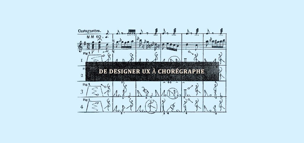
Artfully describing movements of the human body
Choreographers trying to plot dance steps and sequences on paper are often confronted with a hard truth: it is extremely difficult to describe movement through space and expressions of the human body with words.
Yet, the word “choreography” means dance writing or the art of designing sequences of movements through notation. André Lorin first devised this technique for capturing dance in 1686. Choreographers use it to “sketch out” their ideas and help dancers, stage technicians and others understand their intention, while also avoiding issues with synchronization.
Choreography on paper: André Lorin, Livre de contredance présenté au Roy (manuscript, 1686).
From dancing to interfaces
The design of a website interface presents many of the same challenges as the creation of a ballet or tango. The practice of permanently placing content within a defined area is a thing of the past. Since the advent of responsive design, every element and functionality on the screen must “dance” to fill the user’s selected screen. Much like a choreographer, a user-experience (UX) designer must describe how different elements of the interface with react, reposition and resize to fit all screen sizes. Furthermore, much like a dancer must learn and perform a choreography, a graphic designer must understand the proposed UX design and implement it without causing inconsistencies from one platform to another. Lastly, the developer and integrator must execute the plan, all the while respecting what the designer has created.
How to align these different perspectives without producing endless documentation?
Choreographing content
UX designers, like Lorin in 1686, have developed a technique that all can understand, including the client. It’s called content choreography. A few weeks ago, the company Axure announced version 7.0 (beta) of its very popular interactive prototyping software, which integrates use of this technique with wireframes. Thanks to the new adaptative views functionality, a designer can now define breakpoints and choose a base resolution, which is very important when working “mobile first”.
Simple and practical steps to creating content choreography:
Step 1: Prioritize content
This step consists of collecting all content and determining which items are top priority and should appear on the home page. We prefer sharing this process with the client, as the home page tends to elicit much discussion. We start with the information architecture and highlight which elements are most important for the user, while never losing sight of the client’s business objectives.
Step 2: Sketches, drafts, drawings and doodles
From there, the UX designer drafts the interface, starting with mobile. He or she takes the selected elements and sketches them in, one after the other, according to the priority that’s been established.
After mobile, he or she then designs the iPad interface (1024 pixels) and 1200 resolution. At this stage, important decisions must be made about the main grid of the interface, taking into consideration the selected elements and the priority designated to each. If content doesn't fit on the screen and a carousel is proposed instead, it's also our responsibility to explain why this is a bad idea in most cases. But if we have no other solution, we want to do it well.
Personally, I always sketch by hand before using a computer. I’ve noticed that while the solutions are on paper, stakeholders in the project feel more comfortable making comments and sharing their points of view. It also helps avoid path dependency, which occurs when people assume that the version is final simply because it’s on a screen.
Step 3: Create wireframes with Axure
This is where Axure shakes up the usual way of doing things! Once all stakeholders (including developers and integrators) have understand the sketches, the UX designer then uses Axure to create wireframes of the content choreography.
When working in Axure, our first step is to define the project’s breakpoints using the Adaptive View Manager tool. Usually, I select three: 320 to 1024 pixels (optimised for tactile interaction), 1024 to 1200 pixels and 1200+ pixels. Having completed many responsive design projects, our team systematically keeps coming back to these dimensions because they deliver optimal value for users.
Finally, we create the wireframes. It’s important to build them in order (start with 320, follow with 1024 and end with 1200), as Axure uses a resolution inheritance system that will ultimately save you a lot of time. However, you must understand the system first in order to avoid surprises; that is, modifications made to one resolution will automatically apply to all “child” resolutions, but not “parent” resolutions. For example, if you add a block to the 320 view, it will appear in both the 1024 and 1200 views. But if you add it to the 1024 view, it will only appear in 1200 and not 320.
Step 4: Publish, test and iterate
Now that we have wireframes for all resolutions, we publish the results by clicking the “AxShare” button. This enables us to test the content choreography on all devices. Do remember to get the whole team involved at this stage to ensure that the proposed design works and won’t cause unnecessary complexity.
A good content choreography will help reduce the number of graphic mock-ups to produce and efficiently illustrate to each member of the team how the elements will react – without having to read endless lines of commentary.
Do you have any comments or advice? Don’t hesitate to share!
To help you better understand my process, I’m offering a sample file that you can modify to suit your needs. Please note that you must have Axure RP Pro 7.0 Beta (the beta version is free) installed. If you’re curious, but don’t want to download the new version of Axure, you can also watch our online demo.
References and further reading
Choreography: http://en.wikipedia.org/wiki/Choreography
Mobile first: http://www.abookapart.com/products/mobile-first
Dance notation: http://en.wikipedia.org/wiki/Dance_notation
Building with content choreography: http://www.jordanm.co.uk/post/21863299677/…
Content choreography: http://trentwalton.com/2011/07/14/content-choreography/
Axure RP 7 Beta: http://www.axure.com/beta


