Note: The Liberal Party of Canada has made changes to its website since this blog entry was published. Our observations are based on the site as it appeared prior to August 5th, 2015.
At the beginning of this campaign, which will be the longest in recent Canadian history, TP1 decided to assess the strengths of each party on the terrain we know best: the web and social media. What follows:
- a 10-part analysis of the websites created for each federal party
- opinions from our specialists on the sites of the five main parties
- an overview of party presence on social media
- and a couple of “404 page not found” messages.
We will not be making any predictions and definitely aren’t claiming these opinions to be representative. We are simply evaluating the digital tools used by each party at the crucial launch stage.
We will follow up in coming weeks to see how well these tools are being leveraged…
Party website analysis
From August 1-3, 2015, we surveyed our web professionals to get their analysis of the websites created for the five main federal parties. Our results show that these parties definitely did their homework and have high performance websites going into these elections.
In 2015, it’s all about efficiency: presenting the leader, explaining political agenda, collecting donations and getting Canadians out to vote. Make no mistake – it’s going straight to the point. Of note, the only category of our evaluation in which all parties fared equally “well” is in visual appearance; proof that yes, there is a “mould” for the perfect electoral site on the web.
Despite all this, two parties immediately stand out: the Liberals and the New Democrats. Their delivery of quality information and interactivity sent them to the top of our evaluation categories (6 out of 10 categories for the Liberals and 4 out of 10 for the NDP).
The Bloc Québécois brings up the rear, certainly standing out, but for all the wrong reasons. The website – the only one not optimized for smartphones (big no-no in 2015) – does not deliver the goods and consequently, earned the lowest mark in 5 out of 10 evaluation categories.
Where did they excel? Not surprisingly, these sites do a good job of presenting their leaders and go above-and-beyond when it comes to getting donations.
Here are the detailed results of our analysis:
Evaluation of the TP1 team

“In 2015, it is unacceptable to have a website not adapted to mobile devices. The interactive elements are hard to find (gray in colour, no hover) and little information is given about the result of an action since the labels are vague. Many textual elements are placed in an image, which is not recommended for search engine optimization and accessibility.” – Marc-Antoine Roy, Designer at TP1
“It’s somewhat clean and not too dense, but there is little room for images and the design lacks a certain finesse overall. Uppercase and bold lettering is overused, which reduces readability, and the hierarchy of text is not always well defined. At the outset, there is too much emphasis on the blog; I would have rather seen more about the party or the leader’s vision, and without the ineffectual carousel.” – Guillaume Granger, Designer at TP1
What we like
- Quality and uniformity of images
What we don’t like
- Website isn’t optimized for mobile devices
- We can’t email candidates who have an @gmail.com, @hotmail.com, @me.com, etc. address!
- The form to get involved is run on Google Forms
- Inappropriate use of the Instagram logo, which directs towards a photo gallery. The Bloc is one of the only parties that doesn’t have an Instagram account.
New Democratic Party of Canada
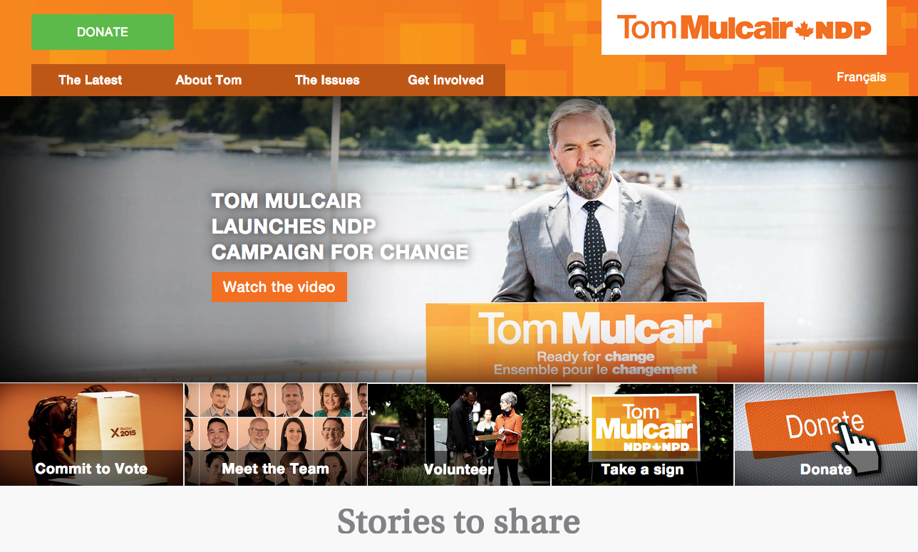
“This website is optimized for mobile devices and features clear and efficient navigation. The page introducing Thomas Mulcair is, in my opinion, the best leader page of the five parties. Rich content delivers an authenticity that the party hopes will be associated with its leader. The donation page is also a success: very graphic, with very simple functionalities built around an efficient process.” – Marc-Antoine Roy
“The website header isn’t very elegant, elements are randomly placed and I question the use of a green call-to-action on an orange background. The template of the home page is fluid and fairly well structured, but it doesn’t present the party’s main agenda. The NDP loses points on a number of other pages. The content is rich, but the typography is too dense in places and the lay-out is not always a winner.” – Guillaume Granger
What we like
- Very successful presentation of Thomas Mulcair
- Graphical elements for social media
- The form to order a sign
- The best donation form of all the sites evaluated and the only one to accept Interac
- Each candidate has a dedicated microsite and platform
What we don’t like
- The “Donate” button is oddly positioned (but probably done on purpose)
- Plenty of interesting content is only available in the footer
- Where is the blog?
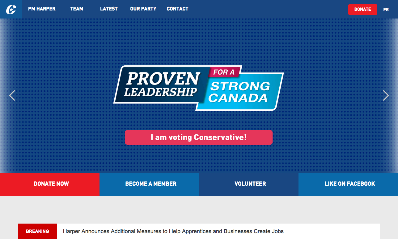
“Featuring a generous menu, the Conservative Party website is adapted for mobile devices and offers an enriched experience with plenty of easy-to-find content. The call-to-actions are aptly phrased and encourage users to get involved. Whatever your leanings, the section on Justin Trudeau is amusing and definitely indicates the Conservative tone for the coming campaign.” – Marc-Antoine Roy
“No frills here for sure. They opted for an ultra-simple template and flat design. Terrifically efficient, the Conservative Party website delivers the best design and offers the best mobile experience. They could have gone for more wow, but the information is presented in a very clear, well-structured and perhaps even bold fashion. Images are well showcased, thanks to customized article templates. The pages on the history of the party, unfortunately, are not very dynamic and it’s hard to read such long sentences in 1110 pixels.” – Guillaume Granger
What we like
- Stephen Harper’s 24/7
- The simplicity of the donation form and the option of making a monthly donation
What we don’t like
- The mega-menu that makes navigation slow-going, especially on small screens
- There is no section to present the party’s political agenda
- Candidate profiles have very little information
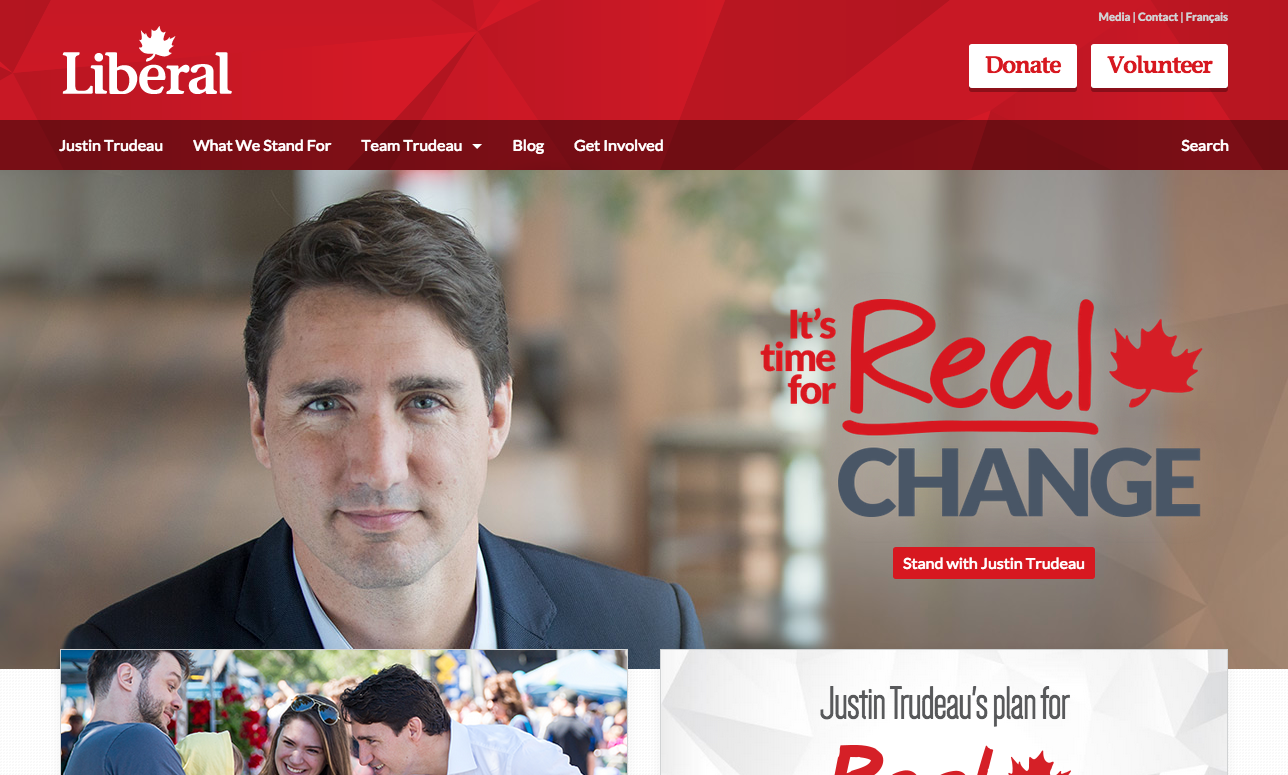
“The classic navigation facilitates exploration of content and reinforces the party’s narrative. Many interactive elements offer relevant feedback, which enriches the user experience. The real-time news alerts are a nice dynamic touch.” – Marc-Antoine Roy
“The superimposed images create a chaotic effect, but the information itself is very clear. The ever-present menu in the header works well, but the style sheet could be simplified to improve the consistency of typography. The design appears less refined on a mobile screen.” – Guillaume Granger
What we like
- The What We Stand For page with its interactive tools
- The Action Centre, which is a hub for those who want to get involved
- The online boutique
What we don’t like
- Why is $20.15 the default donation amount?
- The only site to fail the donation form evaluation
- Lack of consistency in the navigation on different parts of the site
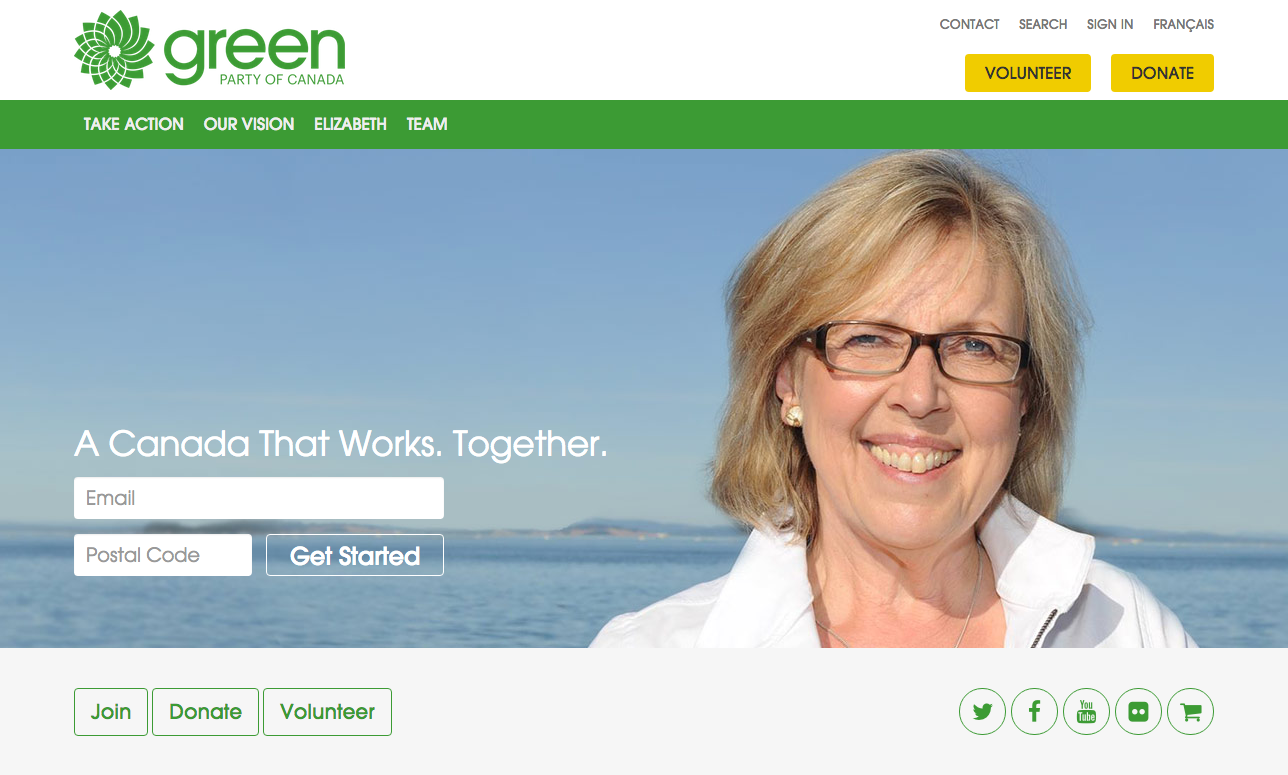
“This website has a fairly standard structure, which facilitates the hierarchisation of content and call-to-actions. I particularly like the Count me in section, which clearly presents all the ways you can get involved. The omnipresent green and white makes the experience a little boring, but it does reinforce the party’s image.” – Marc-Antoine Roy
“The design is lacking somewhat when it comes to typography, moving from serif to sans serif with no apparent logic. As a result, the hierarchy of content could be improved. The simple template presents the information well. The home page doesn’t display well on mobile though, with certain elements getting superimposed and the call-to-actions are hard to tell apart. The whole is more or less well done and content deeper within the site is easily browsed. Also, the huge roll-down menu in the footer should have been done differently.” – Guillaume Granger
What we like
- A clear call-to-action when you land on the website
- It may not be the sleekest site, but it’s complete and fulfills its objectives
- Donations can be made via PayPal or directly to your candidate
- Online store
What we don’t like
- Lack of finesse in the design and user experience
- The blog deserves more kinds of content (photos, videos, etc.)
On social media
During these elections, political parties will be using social media more than ever before to communicate their messages and mobilize voters. But there’s a long row yet to hoe. This task will be a moment-to-moment effort for candidates and their online community managers, but it is the media of choice for instantaneous impact.
We have established a social media portrait for each party and its leader at the beginning of this 42nd Canadian federal election. But we will only know the winners and the losers on this battleground in 11 weeks. It will also be fascinating to analyse how big an impact social media had on the various campaigns.
Twitter and Facebook
When we compare community size, the parties can be sorted into two groups: the mammoth Conservatives and Liberals… and everyone else. With a total respective audience (accounts of both the party and its leader, both languages, Facebook and Twitter) of over one million people, the Conservatives and the Liberals are ahead of the pack. It will be interesting to see how they’ll make use of this advantage…
It is a compelling observation that the Facebook and Twitter accounts of the leaders are far more popular than their party accounts; in the case of Stephen Harper, it’s five times more popular.
Also of note, the small following for the French-language Twitter accounts of all parties (except the BQ), as compared to the English-language accounts: 5% audience for the Liberals, 3% for the Conservatives and 1% each for the NDP and the Green Party.
Even if it’s only the beginning of the race, we have observed that Bloc followers (37% engagement) and NDP followers (32.5%) are more outspoken on social media. The Liberal (26%), Conservative (19%) and Green (17%) followers are not all that far behind though.
Lastly, it’s worth noting the huge increase in Gilles Duceppe’s Facebook popularity (7.5% growth), and that of Thomas Mulcair (3.8%) and his NDP party (3.7%) over the last seven days ( as compared to other parties).
Other social media
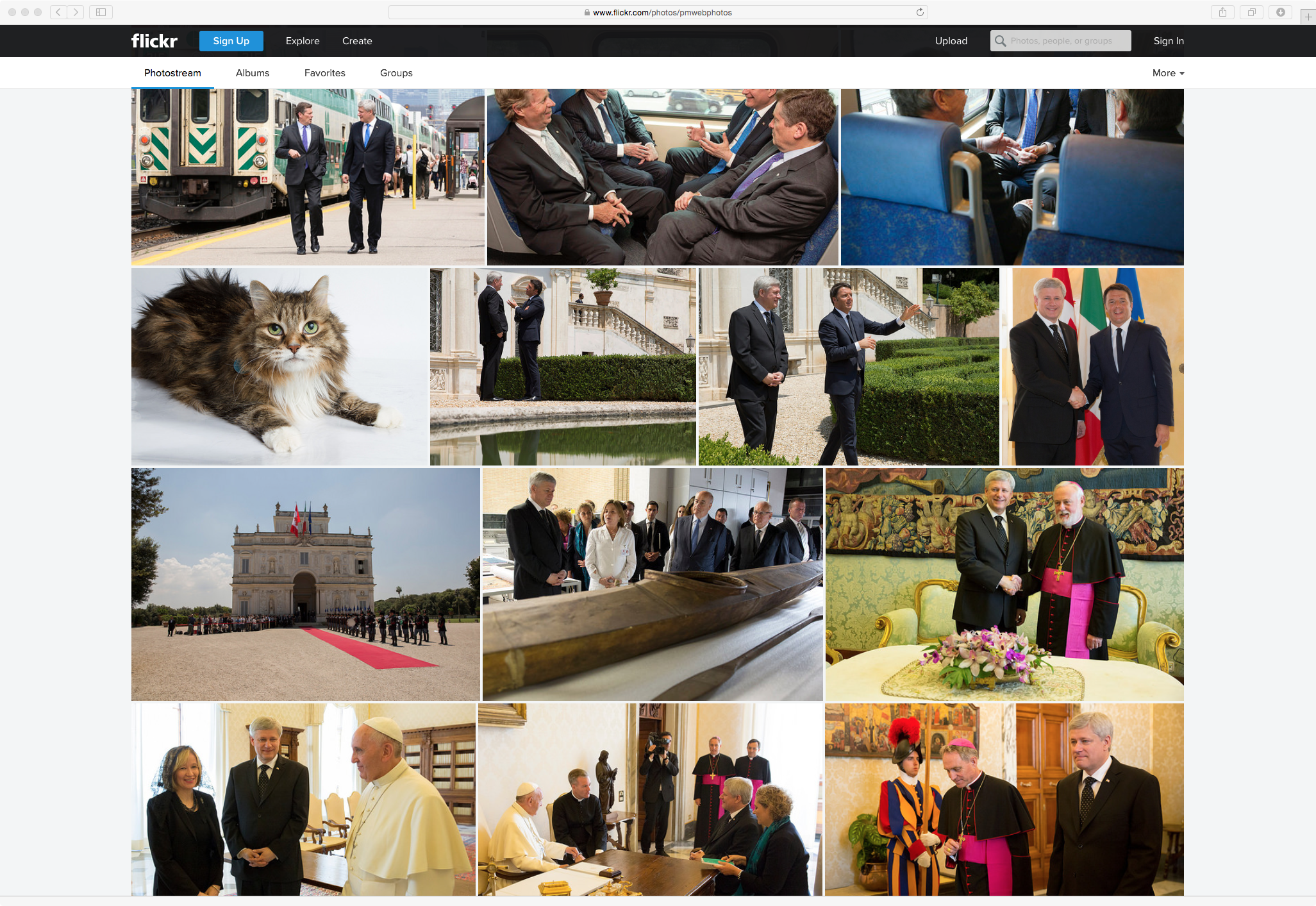
All parties are present on YouTube and Flickr, but only the Liberals, Conservatives and New Democrats are on Instagram. The 2015 election will certainly be notable, both on the web and on social media, for its abundance of videos and photos, which have been appearing steadily since the campaign was launched.
We absolutely have to mention Stephen Harper’s Flickr account, which is remarkable for its parade of rabbits, cats and guinea pigs available for adoption. It’s rare to browse a gallery with photos of the Pope and American President Barack Obama, alongside snaps of Pharao, the cat that looks like a rabbit.
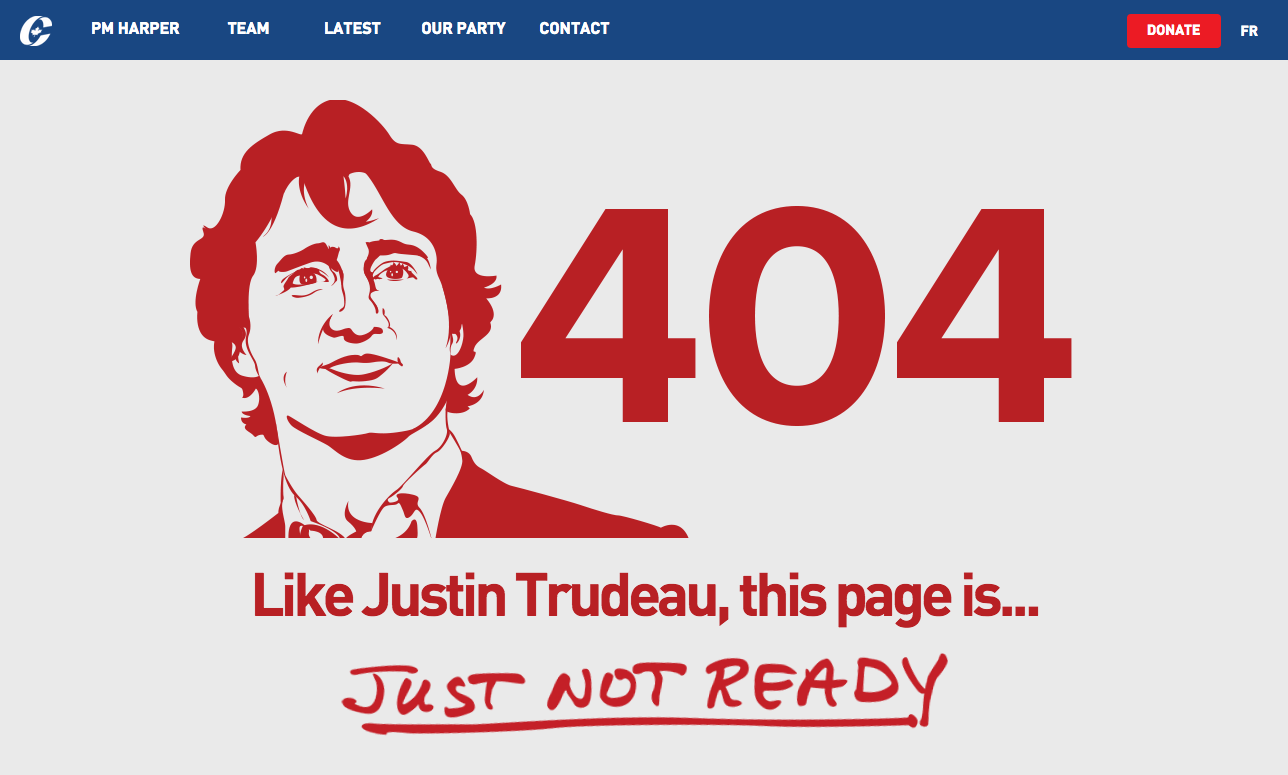
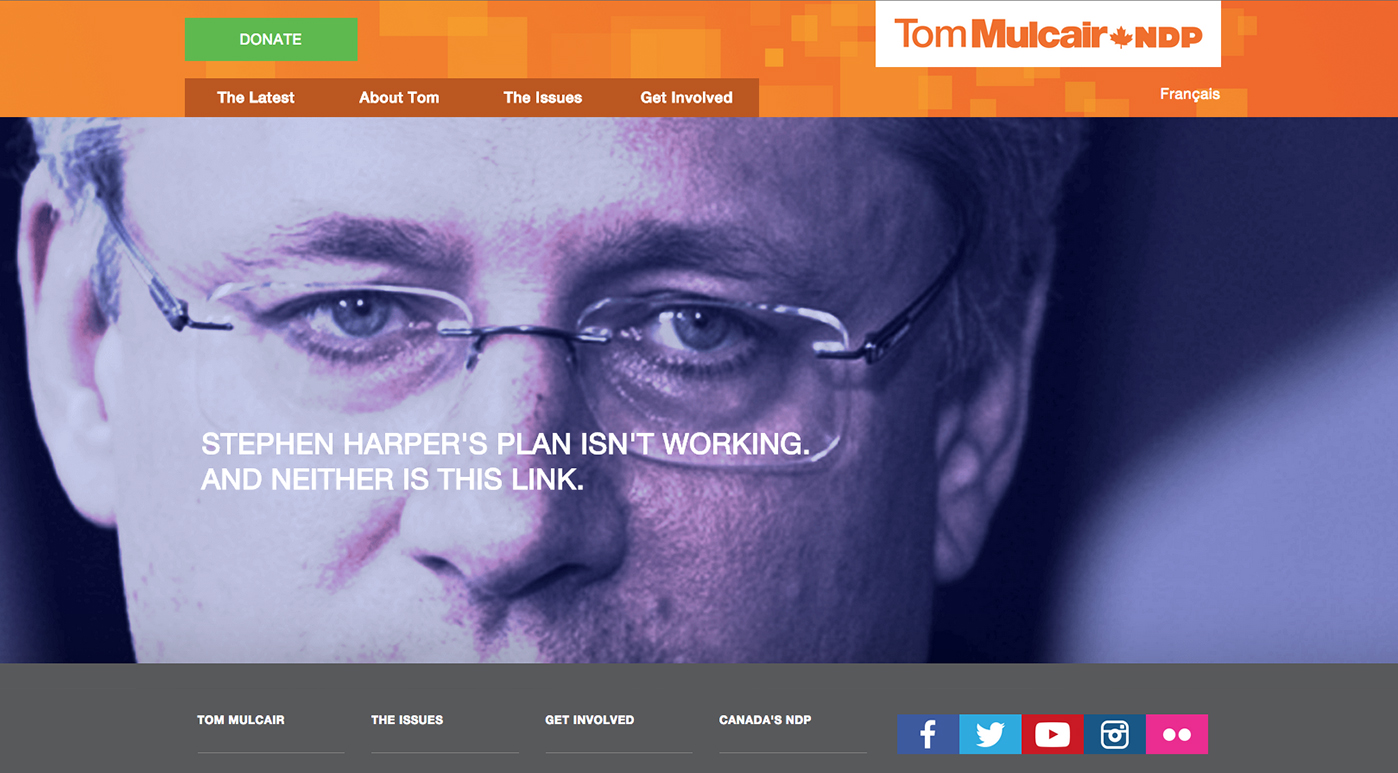
404 page not found
Politics is a game of hardball… even if it’s a “404 page not found” message. The Conservatives’ page is definitely anti-Trudeau and the NDP page is anti-Harper. It will be fun to see what the other parties can come up with!