Last year we did a bit of work for the FRINGE, notably strategies for Twitter and foursquare, and a live projection in the Parc des Amériques. It was a good start, but we really wanted the pièce de resistance: creation of a poster for the festival.
Encapsulating the spirit of the FRINGE is not an easy task, and it had to be done within a limited amount of time. After consulting with Amy Blackmore, the festival’s new band leader, the objective for this edition was clear: to take a different approach that in years past. The eclectic, rebellious, and experimental edginess had to be replaced with a more open spirit reflecting the larger community. The posters of the past were provoking, but this year, the poster had to inspire.
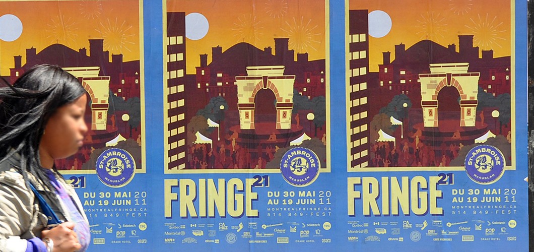
This year’s theme, “Spectacles de quartier”, symbolizes the first phase of this transition – a concept that revolves around the community in which the festival takes place. The participation of the Plateau and Mile-End residents really makes up the essence of the festival, and FRINGE 2011 is very appreciative of that.
In developing the concept, the team was inspired by vintage travel posters. Combining large graphics and bold fonts, these posters were, in another time, a unique way to inspire travellers. The graphic language alluded to the prospect of a rich, cultural experience in a foreign land.

With the help of Mylène, our graphic design intern, we gave FRINGE Park a visual facelift. In our poster, the arch is the focal point symbolizing the famous corner of Rachel & St-Laurent. We really had a great time recreating the look and feel of this nostalgic style. Especially when we used a paintbrush to add multiple textures to the piece.
And here’s the result (as well as extras on TP1’s Flickr account):