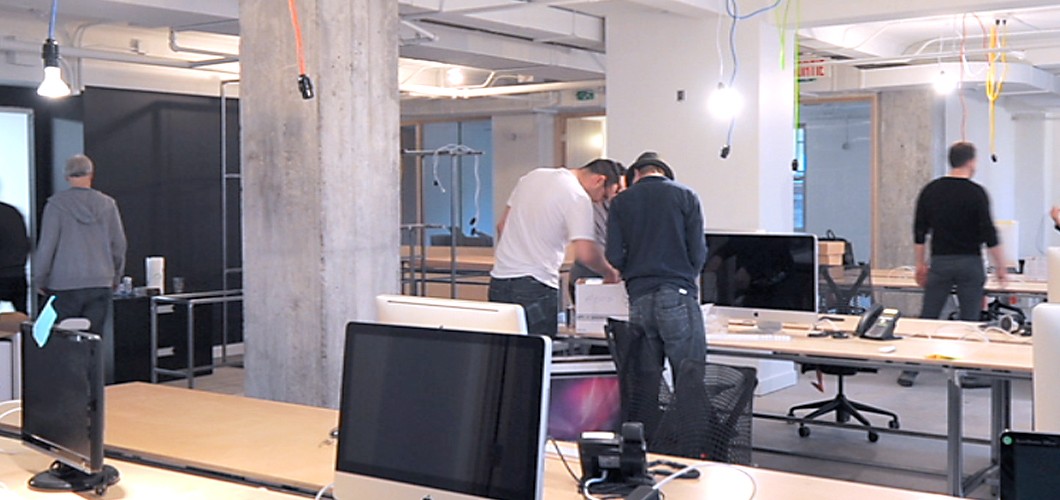
Perhaps like me, you never really noticed that there was a whole building above the Chapters store. But there is and it’s called the Castle Building. Not only does it have a rich history, but it’s also the new home of creative agency TP1. Jan-Nicolas Vanderveken asked me – an occasional resident – to give you the virtual tour.
From tea to TP1
Completed in 1927, the Castle Building – named after the Castle Tea Company – was considered one of the higher buildings in Montreal at the time. It was the architectural brainchild of Ross and Macdonald, one of the most notable architectural firms of the early 20th century and the designers behind some of Canada’s most recognized buildings. In the last 80+ years of its existence, these walls have helped earn income for doctors, life insurance clerks, and exporters, as well as overseen the dealings of diplomats from Mexico, the U.S., Chile, Sweden and Norway.

Castle building typical floor plan c. 1927.
So the Castle Building definitely has pedigree, but what drew TP1 to this location? Other than the prime downtown location, of course.
The quick answer to that would be: the light.
The man charged with making the new office interiors pop was Vincent Hauspy of Moureaux Hauspy + Associés designers (MHAD). He and Jan-Nicolas made the visits of prospective sites together: “We had two spaces to visit, but this one stood out. With windows on four sides, full southern exposure and the location, spaces like this are a rare find in Montreal.”
Once the new space was found, the next challenge was how to make that space feel uniquely TP1.
Where to put the karaoke machine?
“There was a lot of collaboration between the designers and TP1 to make sure the look was perfect,” explains Hauspy. “We both agreed that the space needed to be open and naturally luminous, with some industrial finishes, but we also wanted it to be warm.”
And MHAD made it so. Exposed walls and beams help to filter light through the work area, while the kitchen and “chill” areas exude unexpected warmth. Heck, on a wintery late afternoon, nestled in a cosy couch, with low light bouncing off the long kitchen tables and a laptop balanced on your knee, you almost forget that you’re in an office.
But let’s not forget that this is also a place of business, people! Although TP1’s DNA is firmly digital, ideas are still born from old-fashioned writing and drawing. To help keep the creativity flowing, MHAD created an atelier room with walls you can write on. Blackboards and white boards cover three of the walls, while the fourth was partially converted into a floor-to-ceiling corkboard. The conference room – with its table made from a recycled bowling lane – is also primed for productivity with just-right ergonomics and a style that retains the building’s original cachet.
It’s all in the details
Although turnaround time was tight, the new office features distinctive details that authentically reflect the agency’s quirky personality and amply express their creative values.
“My favourite element is when you get off the elevator and start walking down the hallway, the first thing you see is a window with a view of the TP1 office,” Hauspy explains. “So before you even walk in, you already get an idea of how creative and engaged this team is. It’s free marketing!”
This scribe’s favourite? The pixelier or pixel board that stands in that very same window, installed to filter the view without closing off the line of sight. Right now, it features an image of Super Mario, but the gang will be able to change the picture from time to time. In fact, each pixel is the size of a standard Post-it, so that creative minds can even change the colour.
In a case like this however, words cannot do ample justice to such a marvellous collection of distinctive touches. You’ll just have to come down and see it for yourself.
All images courtesy of Gold Castle Holdings Limited.


