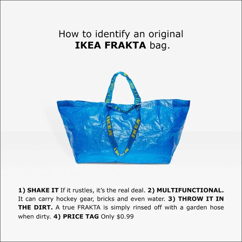
Brands build a variety of associations in our heads… and they make those associations more concrete through the use of beloved symbols and iconic images. IKEA showed its mastery of this concept when it used the famed Frakta bag (instead of products) for a recent campaign.
Why would a brand spend precious advertising dollars to spotlight one of its least expensive items—one that will not drive traffic and only serves a practical purpose? That’s what IKEA did when it chose to celebrate its famous blue bag. Of course, the Swedish brand wants us to transfer our love of this modest item to other in-store items, but it also wanted to build an iconic brand symbol.
These symbols come to embody the brand and help to better define that brand. The affordability, simplicity and practicality of the blue bag also colours how the brand is perceived as a whole. Furthermore, an icon helps a brand expand its imprint in our lives. The more often we see the blue bag, the stronger IKEA takes root in our imagination.
The communications campaign in question was launched when the luxury fashion design brand Balenciaga put out a trapezium-shaped cabas bag that bears a striking resemble to the IKEA Frakta bag. Internet users immediately noticed the similarities between the $2,500 tote bag and the famed Swedish carry-all that only costs 99 cents. This only further underlined IKEA’s image as being accessible and practical. The irreverent tone was also in line with other communications from the Swedish titan. The irony of a popular brand accusing a luxury brand of wrongful appropriation fuelled the campaign’s viral success and contributed to the myth of “don’t challenge IKEA”.

For Stella Artois, the iconic glass is inseparable from the brand. Marketing people call it the “chalice” and it is the foundation of pouring a perfect Stella. The beer tastes better because of it, much like the taste of Chinese food is improved when eaten straight from the take-out box. The chalice is an icon, it’s symbolic of the brand and easily identifiable from across the room, clearly confirming the discernment of its drinker. So naturally, other brewers are following the Belgian brand’s lead and demanding that their brews always be served in their own branded glasses.
The most famous instance of “constructing an icon” is the iPod. Apple has taught us to celebrate creativity by offering products that feature simple interfaces and minimal design. When it was first launched, the iPod was hardly the best MP3 reader on the market, but the click wheel made it fun to navigate. What made this device so iconic is a marvellous feature that has absolutely no impact on sound quality at all—a feature that Sony, RCA or Philips did not offer. That is, white earbuds. This choice went against the current, enabling fans to better enjoy their Apple products and declare allegiance to the brand in a very conspicuous way. In 2001, sporting white earbuds was, without question, the easiest way to tell the world of your creative spirit, thanks to your association with the brand.
Brand managers are becoming increasingly interested in icons. A neuromarketing study has confirmed that people don’t prefer Coca-Cola for the flavour; rather, it’s for the memories that the brand evokes. Magnetic resonance imaging (MRI) has shown that during a blind taste test, the soda activates pleasure areas in the brain. However, when there’s a brand experience added, areas of the brain associated with memory light up the screen. Trademark symbols literally mess with our brains. It’s hardly surprising then that brands are so eager to design iconic, often showy icons and build positive experiences around them.
This article was originally published online in French on L’actualité.
Image from The Poke


